Logos
Our logo is offered in a variety of color, sizes and orientations to help maximize it’s impact for our brand while also creating flexibility for different channels, media sizes and creative layouts. The following will describe the guidelines for variants, sizing, color and usage.
Quick Links:
Variants
Primary
Use the primary OPSWAT logo with tagline lockup whenever possible. This logo is available in all approved colors and in left and center layouts. In a situation where multiple logos will be viewed in an experience, the first instance should include the tagline. Two row tagline variants are also available when horizontal space is limited.

Secondary
Secondary OPSWAT logos without the tagline and logo mark lockup are also available for specialty purposes.
Use the logo without the tagline as a second occurrence in an experience where the primary logo has already been displayed or for smaller applications. Also, use in restrictive spaces where the tagline would be illegible (mobile, web) or when co-branding The logo mark is only used in restricted cases where the OPSWAT wordmark cannot appear legibly in full. It is a graphical element that can be used as a web icon or flourish but does not constitute proper logo usage on its own.

Sizing
It is critical to make our logo stand out and ensure it’s legibility. Secondly, we need to ensure a high impact and pixel perfect legibility experience with our logo. Minimum size guidelines will help to ensure our logo is never an afterthought.
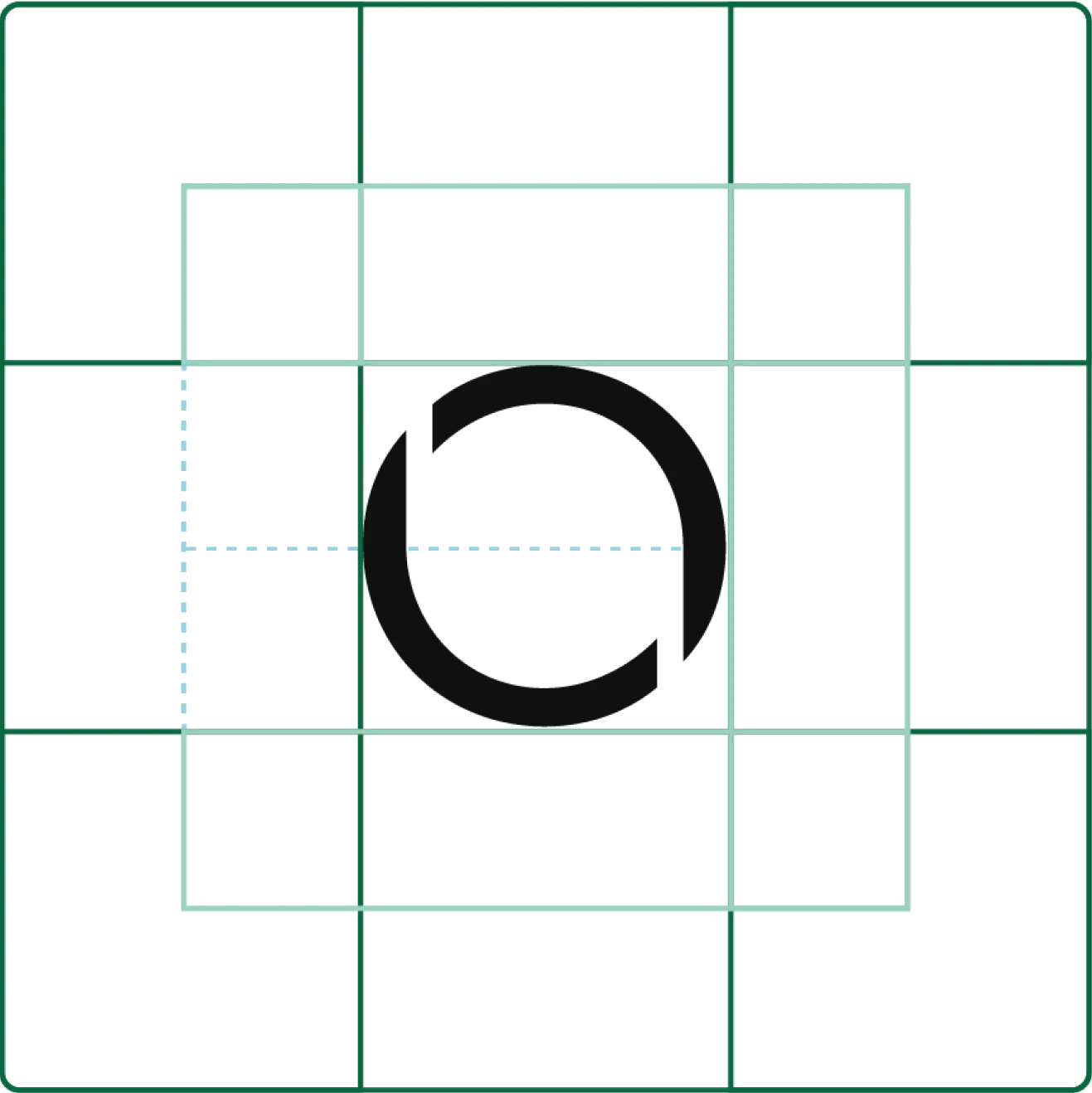
Use the height of “O” in OPSWAT as your registration size.
Optimal
- Full "O” from any edge or other visual elements.
Minimum
- 50% of the "O" height.
- Minimum clear space should only be applied in small formats or special scenarios where layout restrictions apply.

Minimum Size
Minimum size guidelines will help to ensure our logo is never an afterthought.
Color
The color of our logo is important for brand consistency. Only use the provided color combinations. Be sure to maximize visibility and accessibility by looking for the highest contrast level possible. Be sure to choose the correct RGB or CMYK colorspace for your medium.
For detailed information on our color palette:

Dos and Don'ts
The logo files must only be used as provided. They are not to be modified in any way. Here are some common violations to avoid.
Do
Use only official logo files
Do
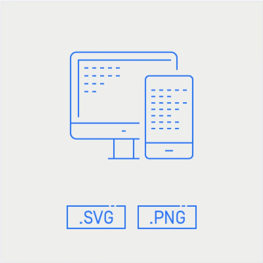
Use correct file formats for screens

Do
Use correct file formats for print
Do Not
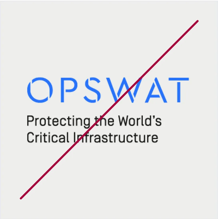
Remove or move the dot after OPSWAT
Do Not
Enlarge .jpg or .png files
Do Not
Use photographic or gradient fills
Do Not
Crop logo

Do Not
Tilt or rotate logo
Do Not
Add stroke to logo
Do Not
Use drop shadows or any effects
Do Not
Change logo colors or create new color combinations
Do Not
Stretch, warp, or distort
Do Not
Place on busy backgrounds
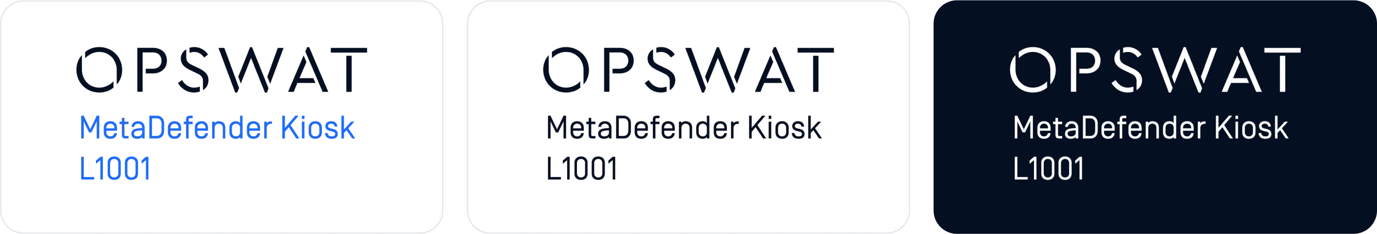
Product Sub-Brands
The OPSWAT logo follows different clear space rules when paired with sub-brands. This allows for a unified presentation, as well as flexibility of use in more limited spaces. Whenever possible, product names should appear light blue and the OPSWAT wordmark appears using our black. A one color version should be used when the full color version would not provide enough contrast from the background.
Product Lock-Ups
It is also acceptable to lockup the product name and model larger than the OPSWAT logo and include a tagline. Pre-defined assets are not provided but specifications to create the approved lockup are below.
- Use the height of the “O” as your registration size.
- Product Name = 2 x “O” Height
- Tagline or Model Line = Simplon Regular 1 x “O” Height
- Same minimum size requirements for the OPSWAT logo apply.