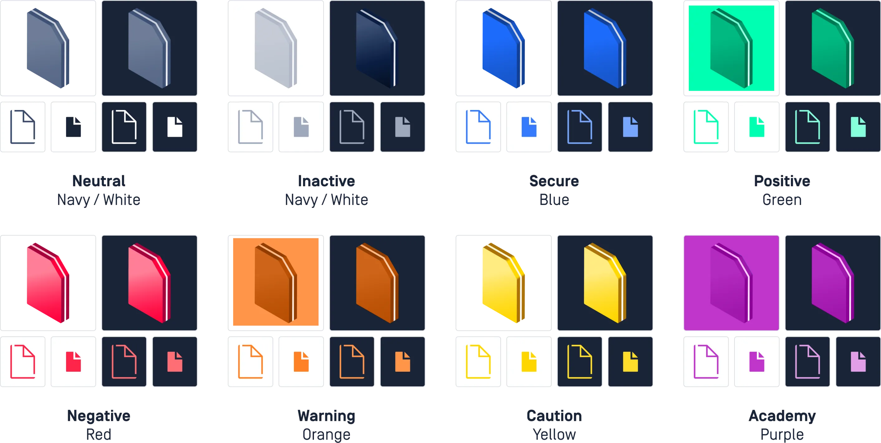
Primary
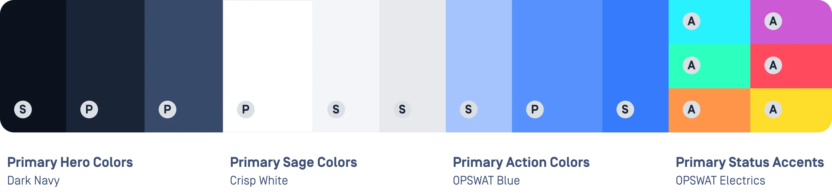
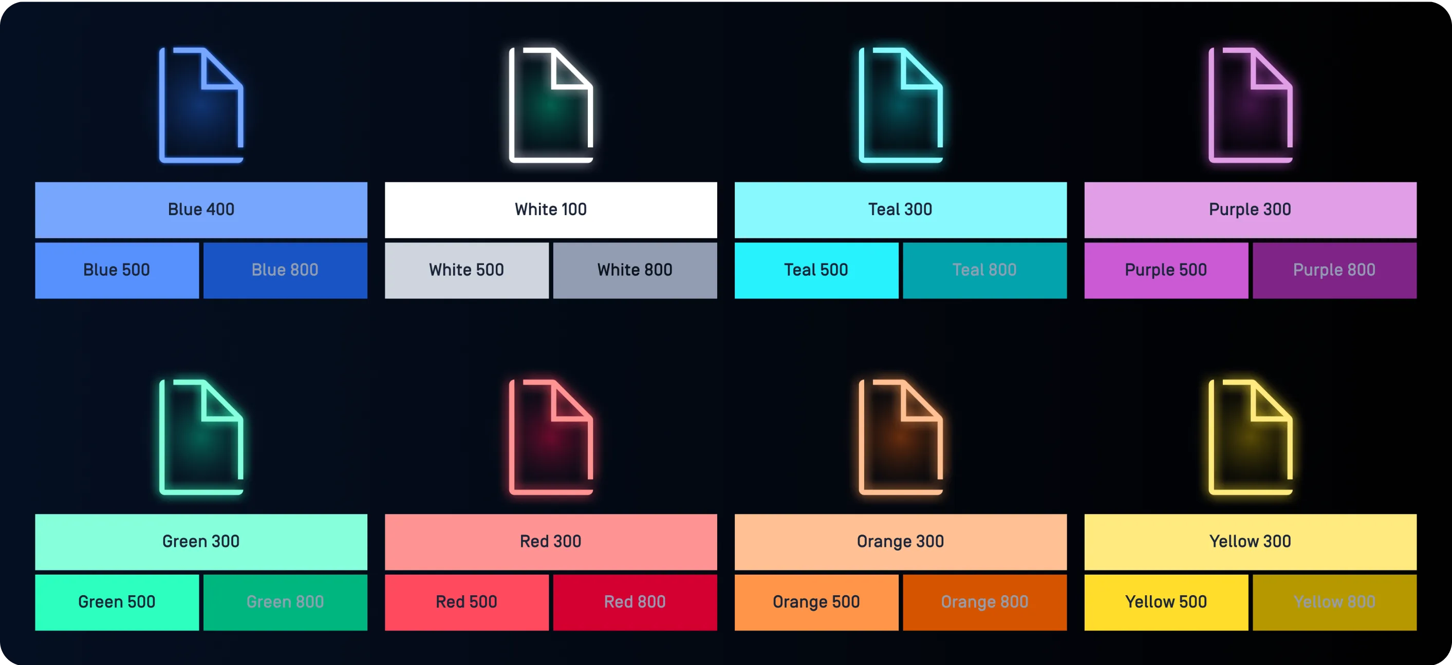
Our primary pallet builds the bulk of our creative and should represent the strongest hues across any piece.
Sending Logs, Alerts, and Telemetry Through a Data Diode
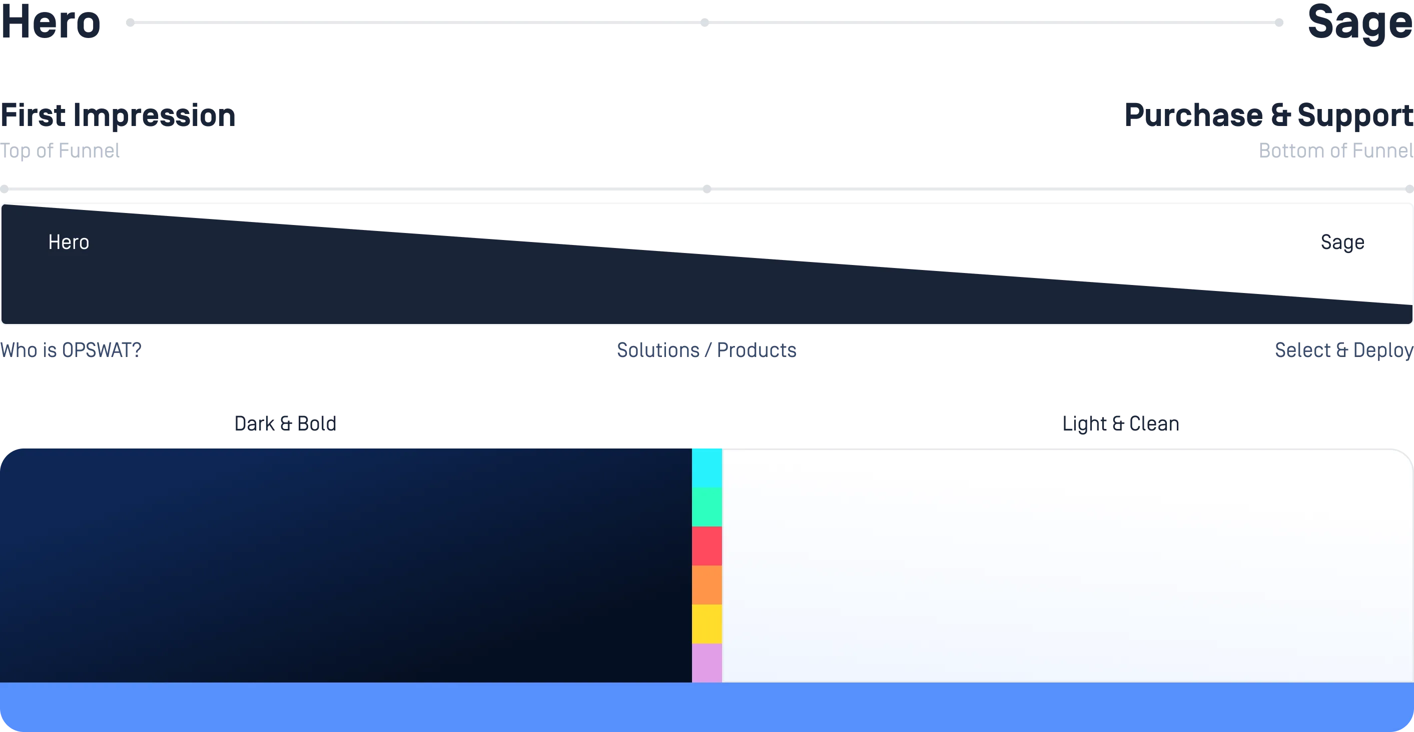
Our color pallet is rooted in our history and the foundation of our appearance. It can be used to strike a bold, confident presence or convey a clear expertise.
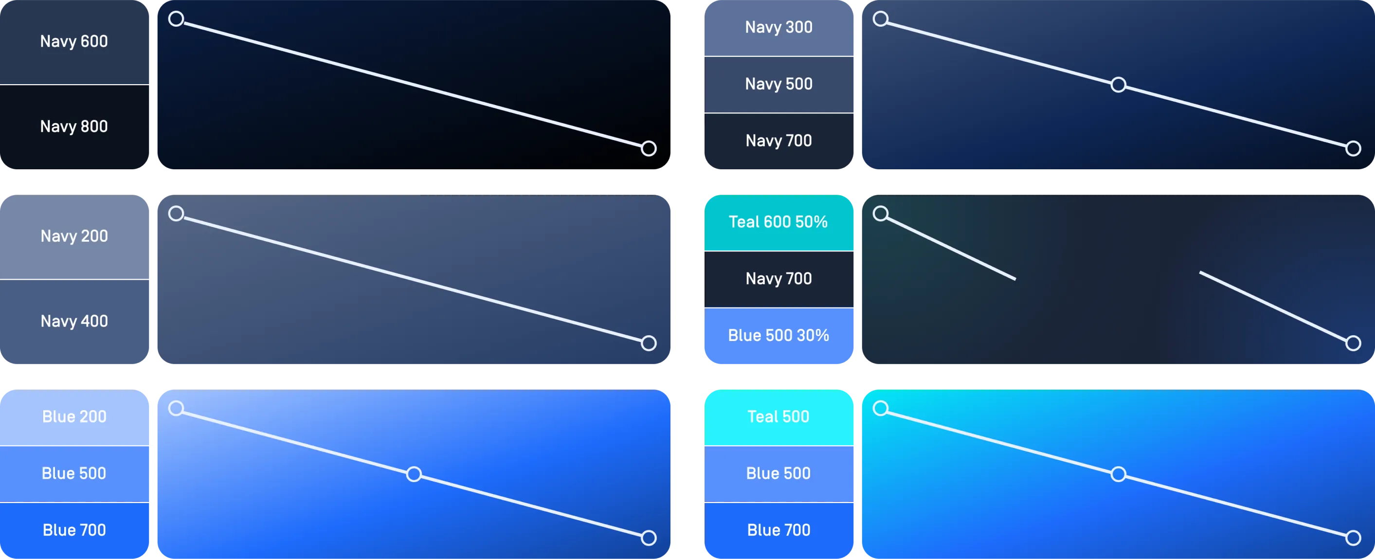
Our color pallet has been organized to support a wide variety of visual scenarios and mediums while striking clear consistency. Tints, transparencies or opaque values of the pallet should be avoided. Instead stick to specified shades.
Our primary pallet builds the bulk of our creative and should represent the strongest hues across any piece.
For flexibility the 3 main color pallets are available in different shade values. Do not tint or add transparency and use the shades as-is.
To accent our primary pallet we also have a set of electric pallets for communicating movement and drawing attention to specific areas. Accent colors should never be used as large swashes of color and should constitute less 5% of the layout.
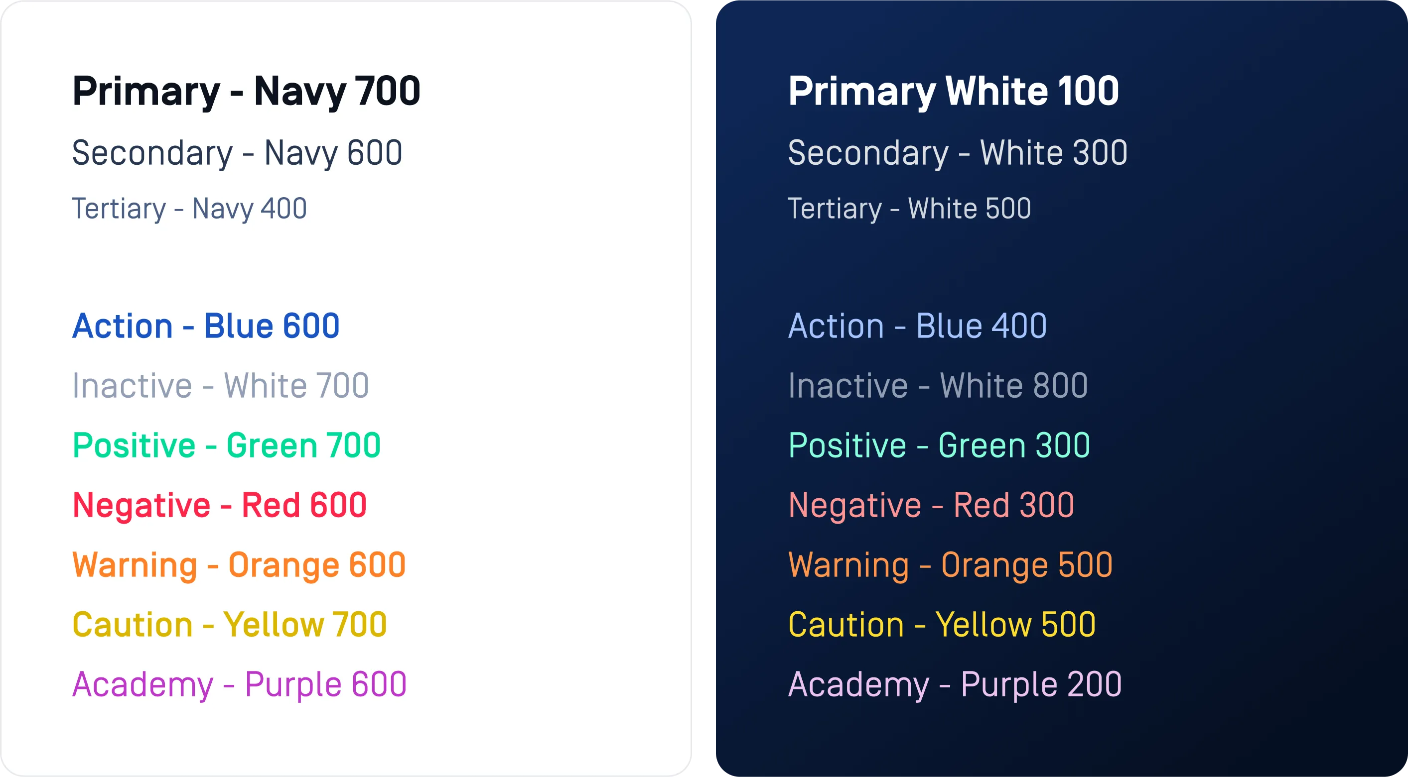
The careful selection of color and its context is pivotal in shaping the creative narrative, evoking emotions, and ensuring visual harmony across design elements. Use type color to create a comfortable reading experience and use color evoke action. Never use an action color as a headline. Reserve our Blue for action and links and avoid using for static type. Be sure to review the accessibility guidelines for proper type contrast requirements.
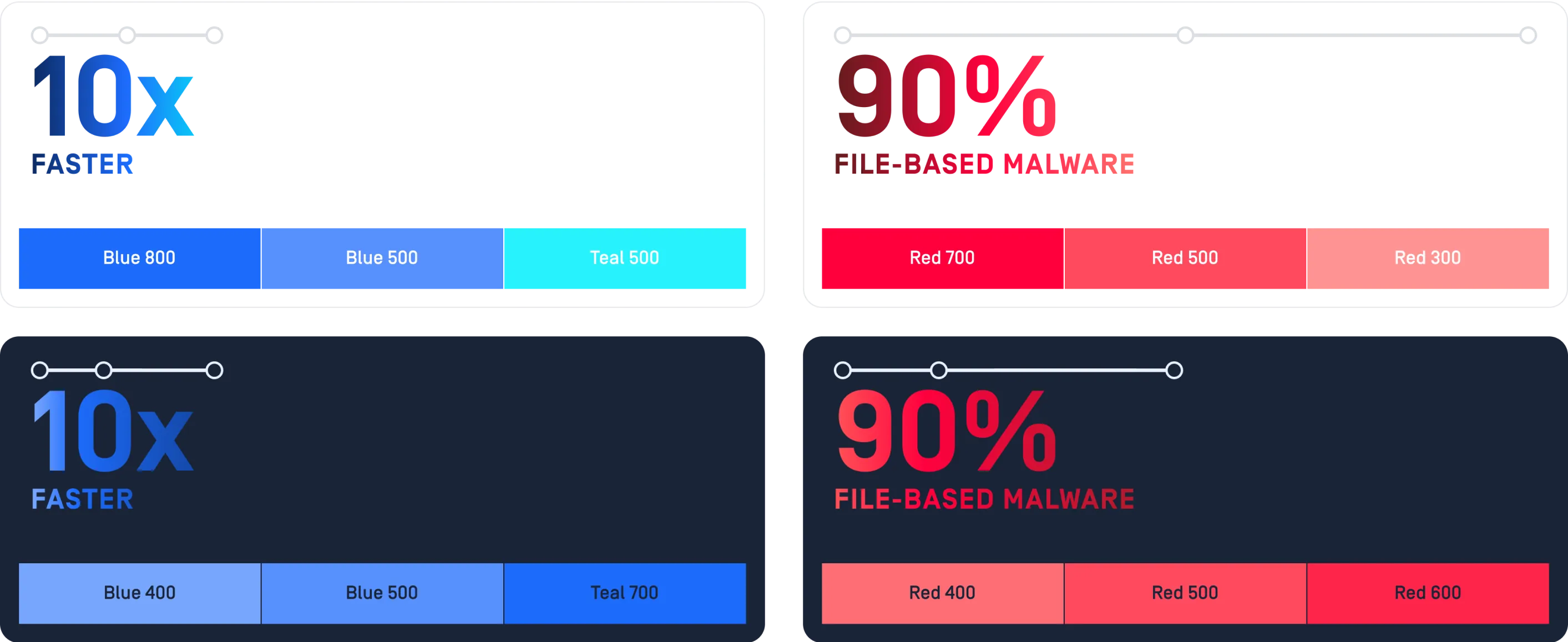
Gradients add a sense depth and help to communicate layering within the composition. They can also be used to color grade and shade areas for typography. Use graduated color as a way to draw the viewer's eye in a direction through the content.
When building gradients try to keep the effect subtle and use a pallet in a skip-step fashion by skipping a color step in a shade group for definition. Mixing color groups can be a way to bring dynamic color to a piece. Avoid using accent heavy gradients as large swashes of color on a piece.
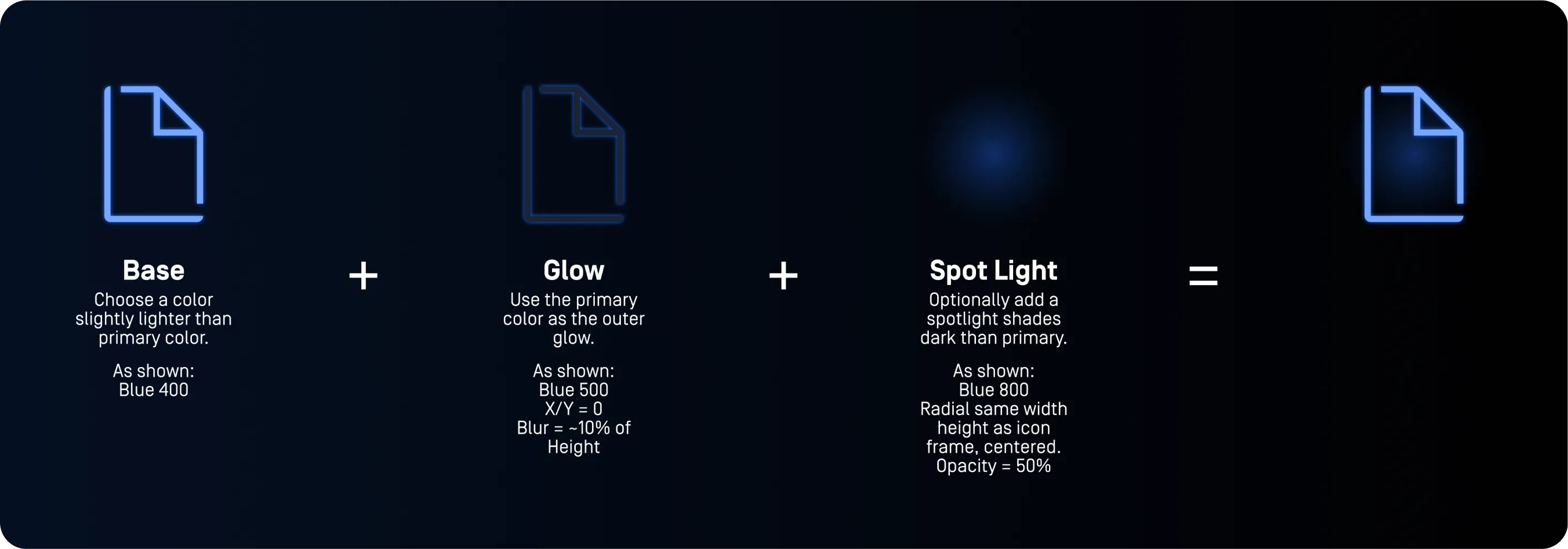
To create our electric effect, use the guidelines below to ensure a consistent look across different experiences.
Use the shades of a color group and build your icon group as shown below. Similar techniques might be used for other illustration shapes, like lines or borders. Glow and spot light size and opacity will need to scale with graphic or text to make the effect subtle and clean.
For type, the same color combinations can be used but pay close attention to accessibility. Avoid using the technique on large, bold font or tiny type. Adjust optional spotlights to form fit the text block.
Specifications shown are for Figma. Adjustments will need to be made to visually match in our applications.

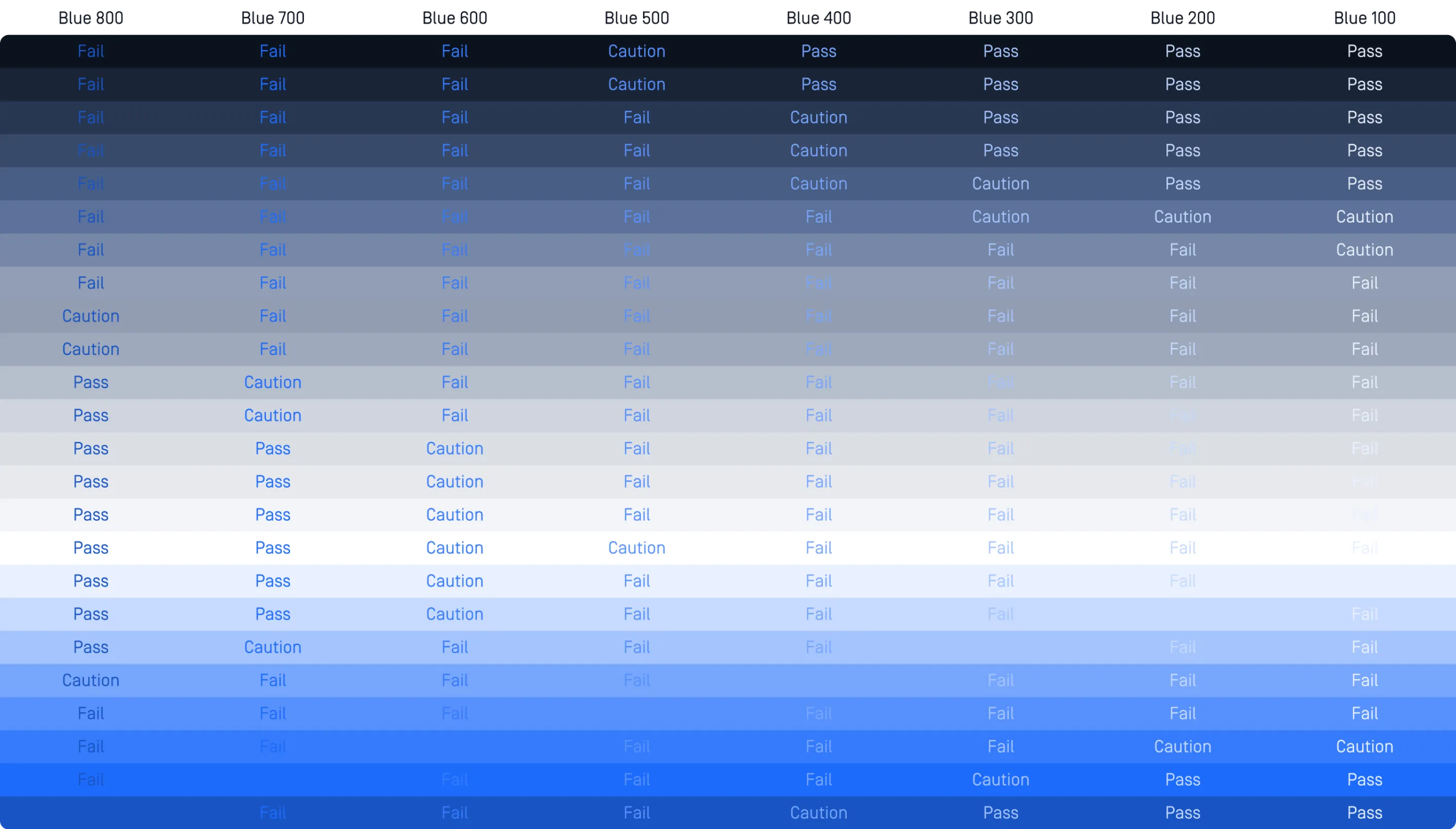
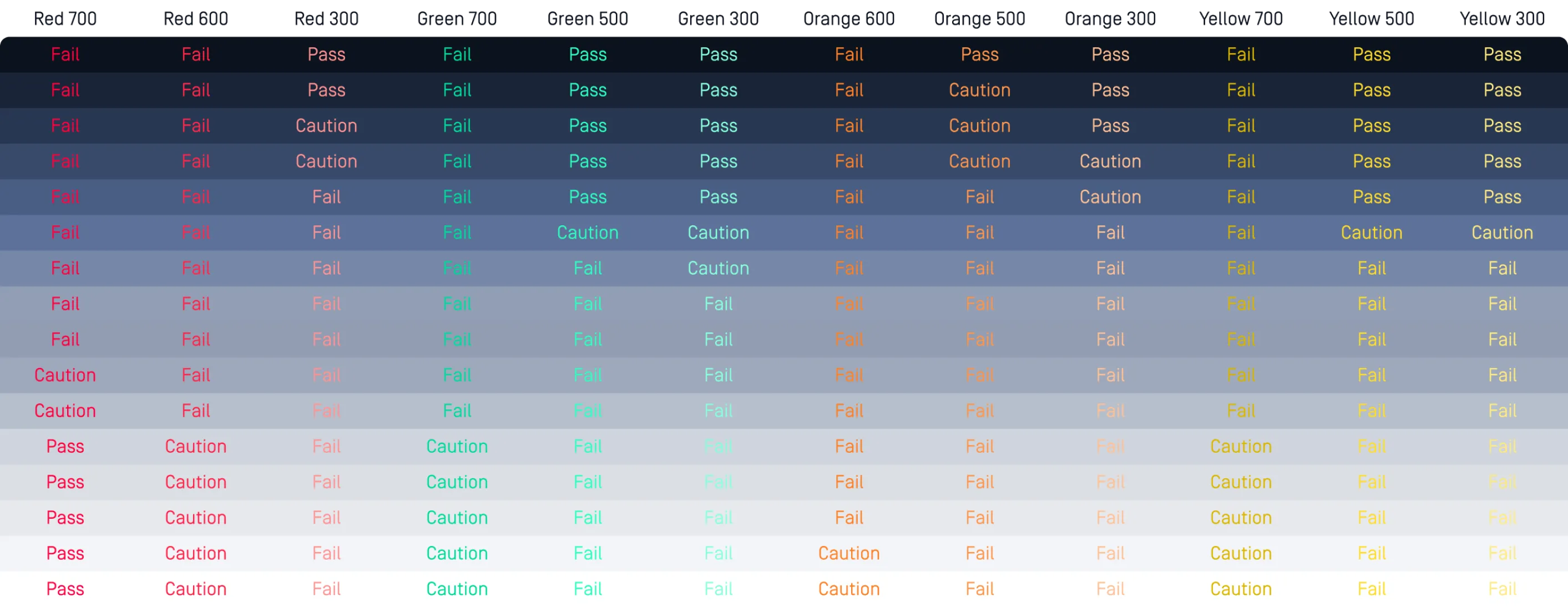
To ensure as many of our customers as possible have a consistent experience we always want to remain as accessible as possible. One way we can do that is by adhering to WCAG 2.1 guidelines for contrast ratios for text.
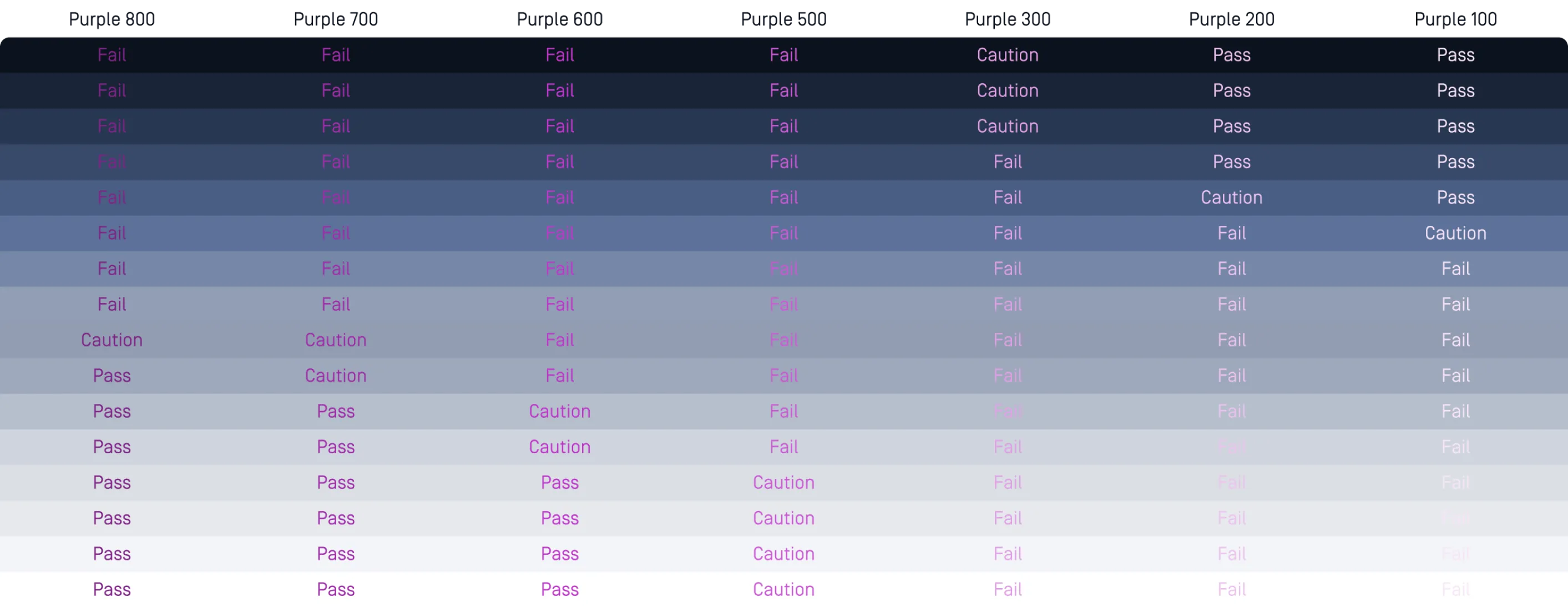
Below you’ll see the full testing of our colors used with our font at 16 pt for acceptable text blocking colors. If marked as “Caution” that means it meets only AA standards and should only be used for large or a bolded weight text.
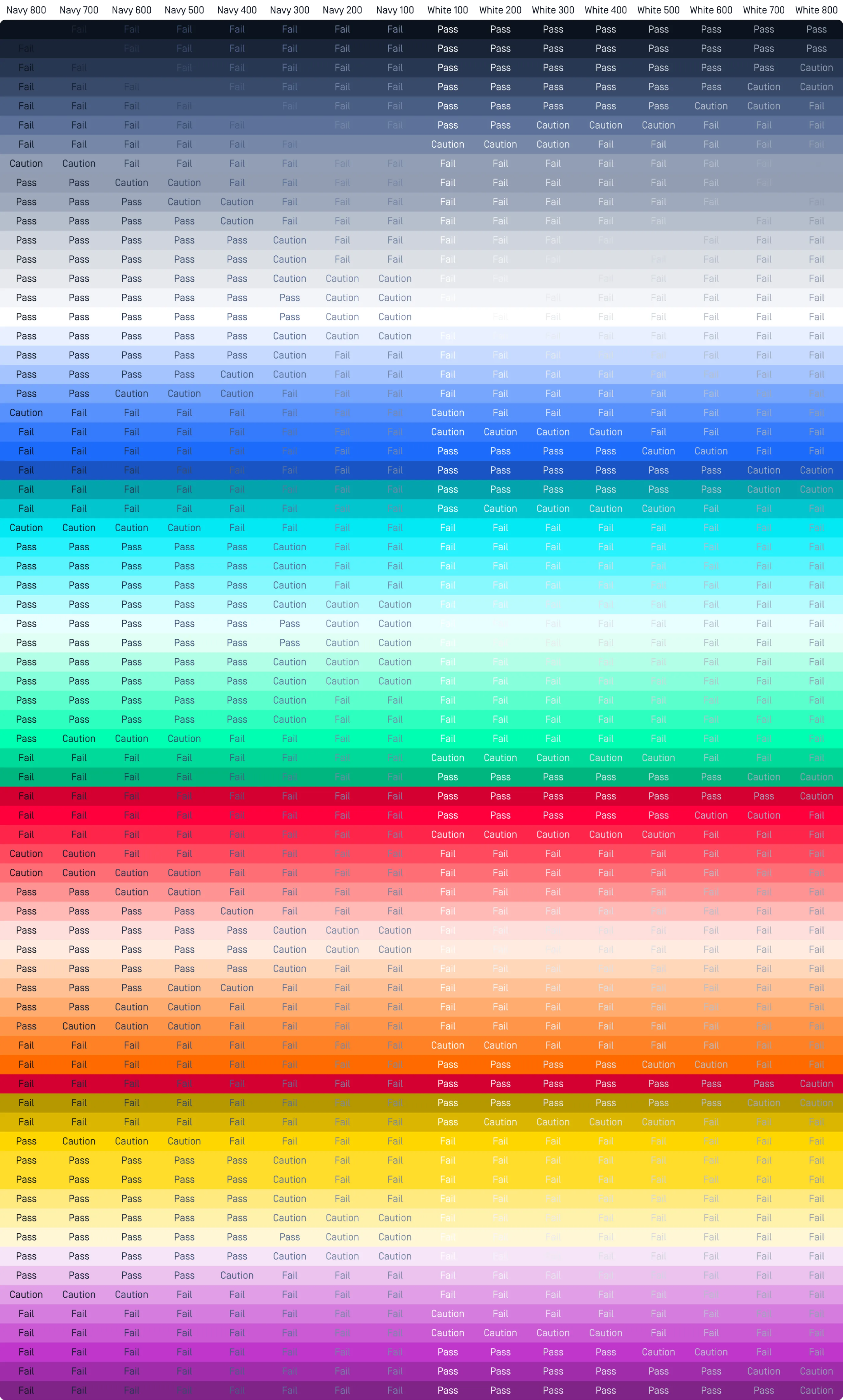
Our OPSWAT Blue color is our main CTA color shade and special attention should be used when placing over our primary color blocks.
When using our status and accents be extra careful for accessibility. If a font color and blocking are shown below they are not recommended.
When using our Academy Purple be extra careful for accessibility. If a font color and blocking are shown below they are not recommended.