The Sensor dashboard is accessible by selecting the Sensor and clicking the Overview icon.
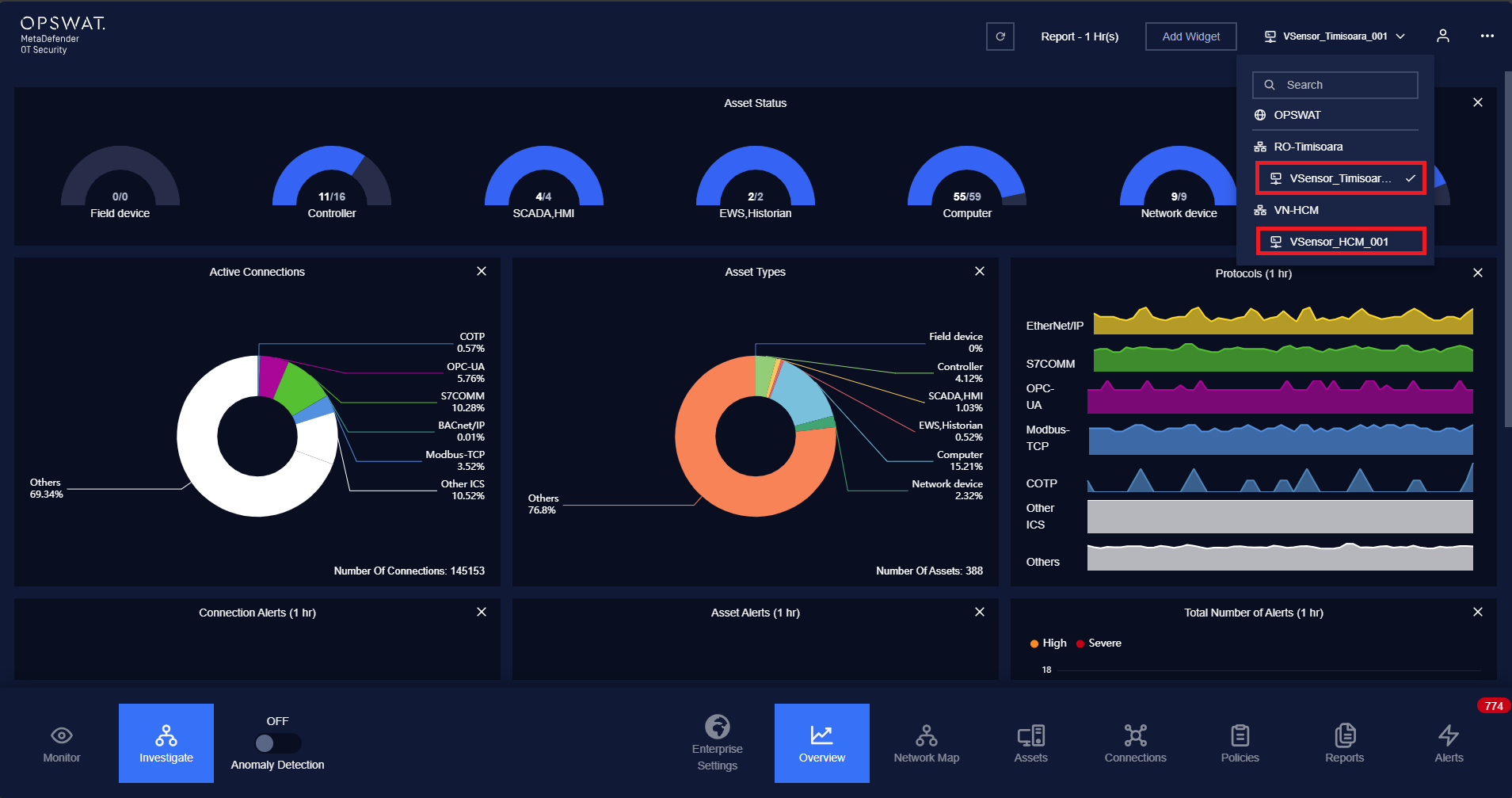
The purpose of this page is to provide an overview of the system with a simple approach so that users can understand and monitor devices easily.
With its expertise and customization, the dashboard is also suitable for professionals who have experience in system monitoring so that they have a complete view of what is happening in their systems.
Overview is a collection of widgets. On dashboard, basic system statistics such as the number of devices by type (ICS devices and others), the number of connections by protocol types, the individual devices with their traffic and alert status are displayed as graphs and numbers.
General operations with widgets
- Show more widgets: press button Add widgets to choose which widgets you want to show.
- Hide widgets: press “X” button on the top of widget that you want to hide.
- Resize widget: hold the bottom right area and expand/shrink to extend/collapse the widget.
- Change widget location: hold the title of widget to drag the widget and drop at wanted location.
- Choose different time intervals: On the top right of dashboard screen, tap on the REPORT button and the drop down list appear to choose a different time intervals.
Device status - Half pie chart

Each half pie chart represents for a device type and the number of devices are being active or inactive on that type.
There two numbers shown below each half pie chart:
- The left number is the number of devices of that type with the status active.
- The right number is the total number of devices of that type.
There are 3 colors that can be displayed on the half pie chart:
- Blue: active devices.
- Dark gray: inactive devices.
- Full dark gray: indicates that there are no devices of that type currently in the system (0/0).
You can click on the half pie chart or its name to go the assets page that display more detail information about device of that type.
Device type/Connections/Alerts - Full pie chart
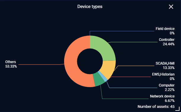
Type of device with a corresponding percentage base on the total number of devices will be displayed on the pie chart, each type is a different color.
The same with another pie chart:
- Active internal/external connections percentage follow by protocols type,
- Alerts for device and connection follow by alert criticality.
Connection with protocols - Line chart
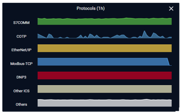
Each line chart will show the number of connections with that protocol in a certain time period.
You can choose to have the line chart show the change in quantity of the number of connections in 1h, 6h, 12h, 24h and also you can tap on a timeline for more information.
Note: The color of each protocol can be customized in Protocol Setting.
You can go to the connection list page of the respective protocol by tapping on the line chart or its name.
Summary of device and connection
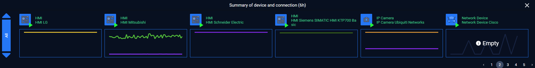
Each device followed by a graph showing its communication and statistics of alerts related to that device.
Each device is displayed with a name and an icon based on its type.
For device status, there are 4 colors can be displayed:
- Green: if the device has exposure score is 0.
- Light Yellow: if the device has exposure score in range 1-25.
- Orange: if the device has exposure score in range 30-65.
- Red: if the device has exposure score in range 70-100.
In the bottom right corner of each icon there is an indicator for the current status of the device, that device is either active (play/triangle icon) or inactive (pause icon).
Each device will come with a graph showing its communication with other devices (what type of protocol the connections are, the number of connections) will be shown in this graph.
Note: When a different time interval (1h, 6h, 12h, 24h) is selected, the components (colors of device names, communication graphs) will change accordingly.
You can click on the icon or name of a specific device to see more detailed information. (device detail pop-up will appear)
On the left of device list is a slider that allows you to select the type of device (Controller, AWS/Historian, SCADA/HMI…) so that the list can be displayed.
Device Management
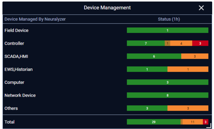
Device management widget displays statistics about:
- Number of Field device.
- Number of Controller.
- Number of SCADAs, HMI.
- Number of Computers.
- Number of Network Devices.
- Number of Other Devices.
- Number of EWS and historian.
- And the total.
The Device Status may have 4 colors:
- Green: if the device has exposure score is 0.
- Light Yellow: if the device has exposure score in range 1-25.
- Orange: if the device has exposure score in range 30-65.
- Red: if the device has exposure score in range 70-100.
Note: Tap on each device type will navigate to the assets of that device type.
Network Map
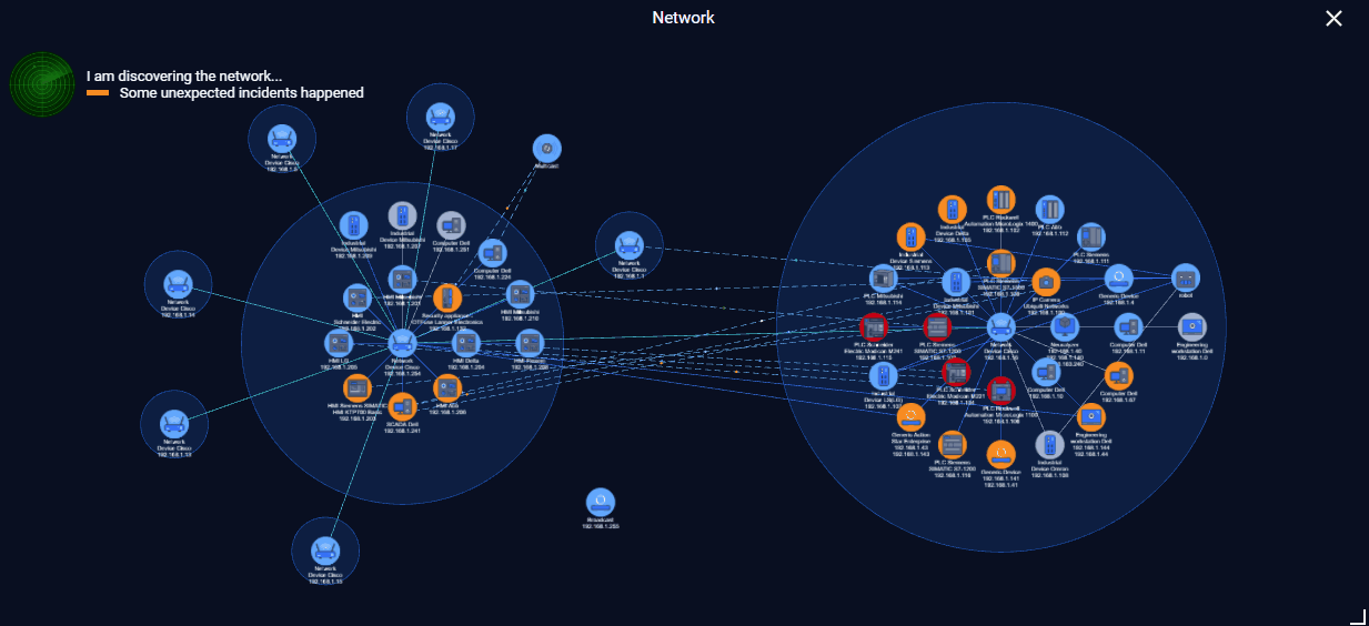
Network widget is a map - it visualizes the real graph with all devices and connections.
On this widget, there is a status line that notify you about the overall status of the system.
Note: You can tap on Network widget to navigate to Network map visualization page.
Current Active Connection
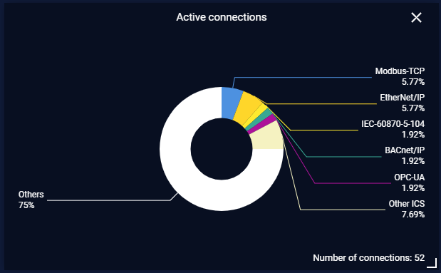
This widget shows the total number of devices in the system and the percentage of devices by type.
Internal Connections
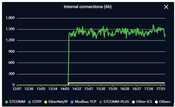
This widget shows the number of connections between internal devices grouped by ICS protocols (S7comm, DNP3, Modbus, Ethernet/IP, profinet, enip) and other protocols in general.
The line chart is divided into time points based on selecting time interval. (1h, 6h, 12h, 24h)
You can choose to hide/show the statistics line of the protocols by clicking on their names in the legends section.
External Connections
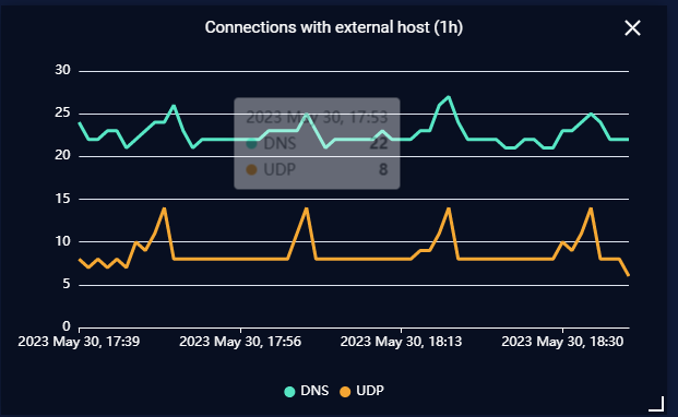
This widget shows the number of connections between devices in the system with remote hosts grouped by ICS protocols (S7comm, DNP3, Modbus, Ethernet/IP, profinet, enip) and other protocols in general.
The line chart is divided into time points based on selecting time interval (1h, 6h, 12h, 24h)
You can choose to hide/show the statistics line of the protocols by clicking on their names in the legends section.
Total Internal Connections
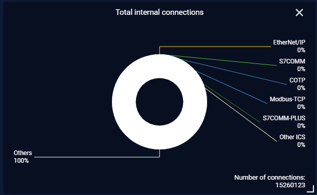
This widget shows the user the total number of active connections between internal devices and the percentage of connections with the ICS protocols + other protocols base on the total number of connections.
Total Connections with External
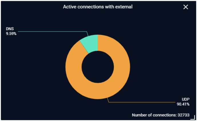
This widget shows the user the total number of active connections between between devices in the system with remote hosts and the percentage of connections with the ICS protocols + other protocols base on the total number of connections.
Device Alerts Matrix
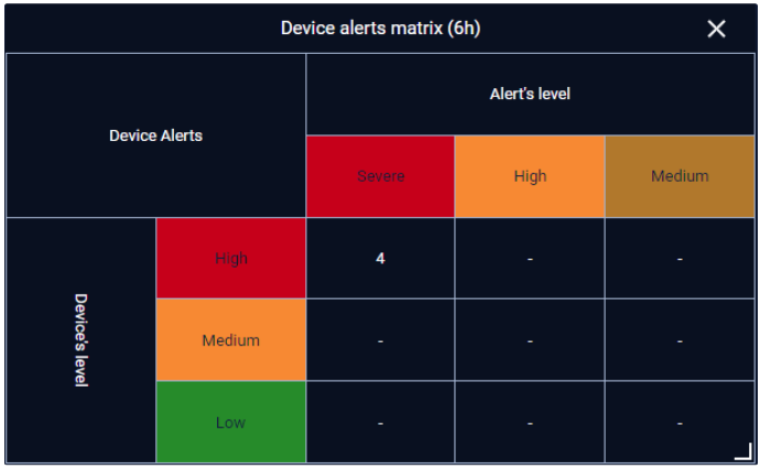
This widget displays statistics about the number of alerts for internal connections based on device criticality and alert criticality.
You can set up for device criticality by setting device type criticality for every device of that type in Device type Settings or setting individual device criticality in device detail.
Alert criticality can be set up in policy page while creating a policy.
Connection Alerts Matrix
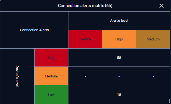
This widget displays statistics about the number of alerts for external connections based on device criticality and alert criticality.
You can set up for device criticality by setting device type criticality for every device of that type in Device type Settings or by setting individual device criticality in device detail.
Alert criticality can be set up in policy page while creating a policy.
Total number of alerts
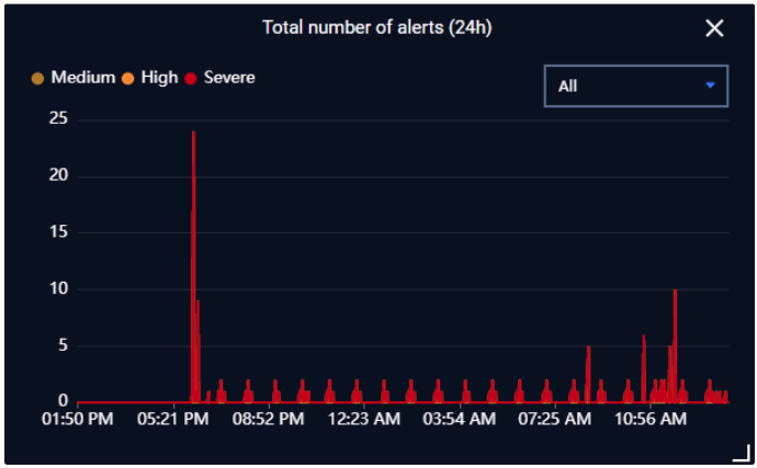
This widget summarizes the alert status within 1h, 6h, 12h, 24h base on alert criticality (medium/high/severe).
You can filter the alert status by:
- All. (by default)
- Pending-acknowledgement.
- Acknowledge-Unexpected.
- Acknowledge-Anticipated.
- Resolved.